30-second answer
Time on site is the average duration of a visitor’s session on your website — typically calculated as the gap between the first pageview and the last interaction GA4 (or your analytics tool) records. It’s not the same as time on page (single-page duration). Most tools undercount it because they can’t measure the final page (no exit event). For privacy-first measurement without cookies, see cookieless analytics tools like Plausible or Matomo.
Time on site vs time on page (what’s the difference?)
Time on page measures the duration spent on a single page. Time on site aggregates across all pages in a single session. If a visitor lands on the homepage, reads for 30 seconds, then spends 2 minutes on a product page before leaving, time on page = 30s + 2min, time on site = 2.5min total.
Both metrics share the same fundamental limit: analytics tools can’t measure the duration of the last page in a session because there’s no exit event to mark the end. GA4 estimates this with engagement_time_msec from heartbeat events — the same signal behind its engagement rate metric, which is more misleading than it looks; older tools just exclude bounces from the average, which inflates the number.
How to measure time on site without GA4
If you’ve moved off Google Analytics for privacy reasons, here are the privacy-first tools that still measure time-on-site reliably:
- Matomo — measures both metrics, supports custom
visit_durationgoals, GPL self-host or €29/mo Cloud. - Plausible — shows “Visit duration” in the dashboard, derived from pageview gaps, no cookies needed.
- Fathom — “Average time on site” stat in the headline metrics row, $15/mo flat.
- Umami — “Total time” + “Average visit time” via the dashboard, MIT self-host on a $5 VPS.
All four are GDPR-compliant without a cookie banner.
“Time on site” sounds simple: people came, they stayed some amount of time, then left. In practice, there are multiple “time” metrics, each with quirks. Read this as a plain-English map to what those numbers mean, when to trust them, and how to use them to make content better.
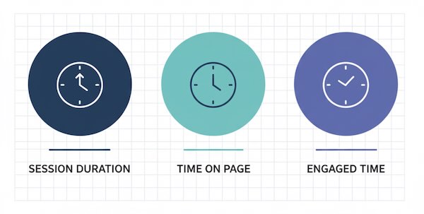
The three “clocks” you’ll see in analytics
| Metric | Plain-English meaning | Best for | Big caveat |
|---|---|---|---|
| Average Session Duration | The average time a visitor spends in a visit (all pages in that visit). | A high-level sense of overall stickiness across traffic sources. | Idle tabs inflate it; a single quick action plus long idle can look “long and engaged.” |
| Average Time on Page / Views | Average time people spend on a specific page before going to another page. | Comparing content types (guides vs. product pages) and spotting under-performers. | If a visit ends on that page, time can be undercounted (no next hit = clock doesn’t stop). |
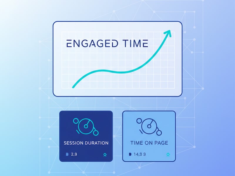
| Engaged Time (interaction-based) | Time when the page is actually in focus and being interacted with (scrolls, clicks, etc.). | A truer sense of attention on articles, tools, and long reads. | Not every setup captures interactions equally; definitions differ by platform. |
Key idea: No single “time” number is the truth. Use the right clock for the question you’re asking.
Why “time” can mislead (and what to keep in mind)
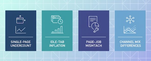
- Single-page sessions look short: If a visitor reads one long article and leaves satisfied, some tools record near-zero time because there’s no second pageview to stop the clock.
- Idle inflation: People open your page, get coffee, answer a call—analytics keeps counting unless your platform tracks “active” time.
- Different page jobs: A pricing page might succeed with two focused minutes; a how-to guide might need six. Comparing them directly is like timing a sprint vs. a hike.
- Traffic mix matters: Visitors from social “doom-scrolling” often skim; email or search traffic tends to linger longer. Always segment by source.
What’s “good” time on site? It depends on page type
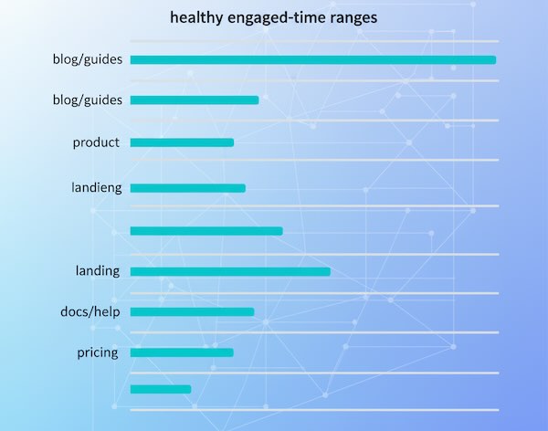
Use these directional ranges as conversation starters, not absolute targets. Your niche and audience will shift the numbers.
| Page type | Healthy engaged time (typical range) | What a healthy pattern looks like | Red flags |
|---|---|---|---|
| Blog posts / Guides | 2:30–6:00 | Steady scroll depth, clicks to related posts or lead magnets. | <90 seconds on 1,000+ words; rapid bounces from search. |
| Product pages | 1:30–3:00 | Interaction with images/specs, add-to-cart views, shipping/returns clicks. | Long time without micro-actions (analysis paralysis). |
| Landing pages | 0:45–2:00 | Swift scan, clear CTA clicks (demo, signup). | Long time + low CTA CTR (confusion) or ultra-short skims (poor match). |
| Docs / Help | 1:00–4:00 | Time concentrated on problem pages; follow-through to success steps. | Multiple returns to the same page without resolution. |
| Pricing / Plans | 1:00–2:30 | Comparisons, toggle interactions, move to trial/checkout. | Excess time on pricing with low trial clicks (friction or unclear value). |
Sanity check: Compare a page to its peer group, not site-wide averages.
Use time metrics to ask better content questions
Time isn’t a trophy; it’s a clue. Here’s how to read it.
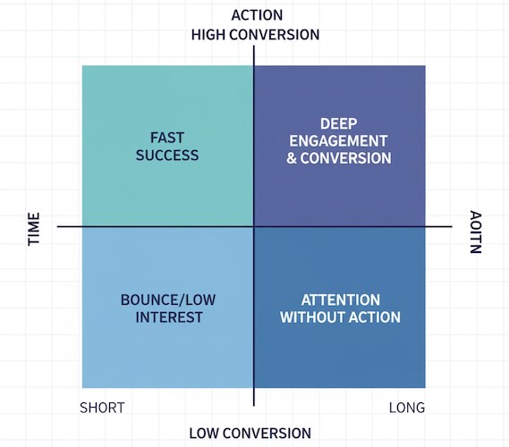
- Short time + high conversions
People got what they needed quickly. Great for utility pages and high-intent visitors. Avoid “padding” content just to stretch time. - Long time + low conversions
Attention without action. Tighten the message, reposition CTAs, or reduce decision friction (too many options, jargon, hidden fees). - Short time + high bounce from search
Likely a promise–content mismatch. Fix the headline/meta and front-load the answer with scannable structure. - Long time on articles + strong return visits
You’re building habit and trust. Offer next steps (newsletter, related deep dives, product tours).
A quick diagnostic table you can use in reviews
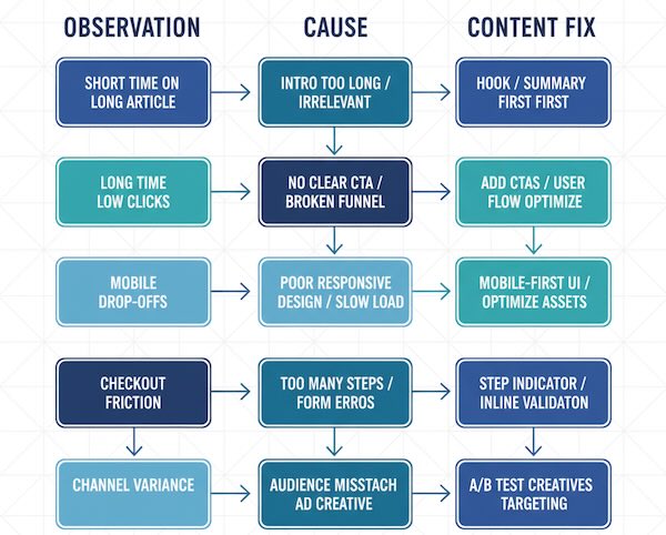
| Observation | Likely cause | Content-level fix |
|---|---|---|
| Very short time on long articles | Weak intro, buried answer, walls of text | Add a crisp hook, summaries, subheads, lists, images; answer the core question early. |
| Long time on product pages but few clicks | Overwhelm, unclear differentiation | Replace fluff with comparison tables, social proof near CTAs, highlight 1–2 prime actions. |
| Time drops from mobile vs. desktop | Layout pain, slow loading, intrusive elements | Simplify above-the-fold, compress media, move secondary content below primary CTA. |
| Good time but exits from checkout or form | Friction right after interest | Shorten forms, clarify shipping/returns, reduce surprises, surface trust signals. |
| Huge variance by channel | Expectation mismatch | Align creative and landing copy; split experiences for search vs. social vs. email. |
Tie “time” to intent—not just length
Two visitors can both spend three minutes, but with very different outcomes:
- Research intent: Reading comparisons and FAQs; success = download, save, or subscribe.
- Buy intent: Skimming specs and shipping; success = cart or checkout.
- Support intent: Seeking a fix; success = fewer repeat visits to the same issue.
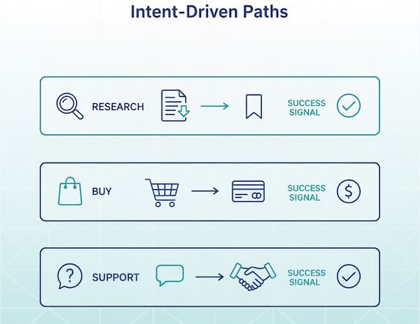
When you review time, ask: What job was the page supposed to do for this segment? Judge time against that job.
Patterns that usually increase meaningful time (without getting technical)
- Lead with the payoff: A tight intro that promises (and delivers) value keeps people anchored.
- Chunk information: Subheads every few paragraphs, short sentences, relevant visuals.
- Insert “micro-wins”: Calculators, checklists, expandable FAQs—light interactions sustain attention.
- Place CTAs where attention peaks: Mid-content CTAs often outperform footer-only placements for long reads.
- Remove detours: Anything that pulls the eye away from the primary story (noisy sidebars, competing CTAs) tends to dilute attention.
Common beginner misconceptions
- “More time is always better.” Not if it means confusion. Efficiency can be a win.
- “Bounce = failure.” Single-page answers can be perfect outcomes. Pair bounce/time with micro-conversions.
- “Let’s set one benchmark for the whole site.” Benchmarks should be page-type and intent specific.
- “We’ll fix time with more paragraphs.” Quality beats volume. Clarity beats length.
A simple review routine you can reuse monthly
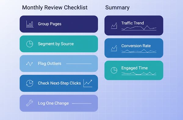
- Group similar pages (blog, product, landing).
- Compare engaged time within the group—flag outliers (high and low).
- Segment by source to see which audiences linger vs. skim.
- Check the step after the page (click-throughs, micro-actions).
- Write one content change per outlier page and recheck next month.
You’ll learn faster by editing a few pages meaningfully than by chasing global averages.
The takeaway
“Time on site” is only useful when paired with intent and next steps. Use the right clock for your question, judge pages against their peers, and read time as a story beat—not the whole story. Do that, and your content decisions will shift from “make it longer” to “make it clearer, more helpful, and better aligned with what visitors came to do.”


