If your reports make sense only to analysts, you’re leaving value on the table. Executives don’t need SQL—they need signal: what changed, why it matters, and what you recommend. Here’s a practical playbook for turning analysis into boss-friendly reports that win decisions, budgets, and trust.
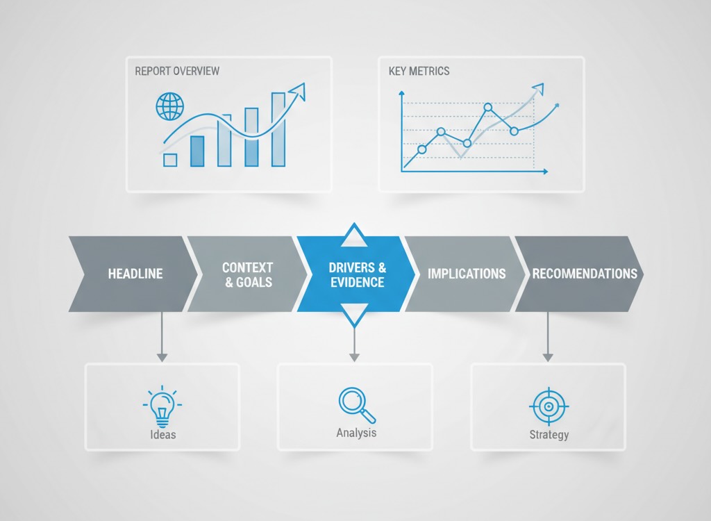
Start with the five-slide spine
Whether it’s a deck or a doc, anchor every report to this narrative:
- Executive headline (1 slide / 1 paragraph)
What happened? One sentence with a number and a verb.
“Paid search CAC dropped 18% QoQ, saving $220k while revenue held flat.” - Context & goals
Against what target? Over what period? For which segment? Tie to OKRs or budget. Add a single KPI table: Target → Actual → Δ → Comment. - Drivers & evidence
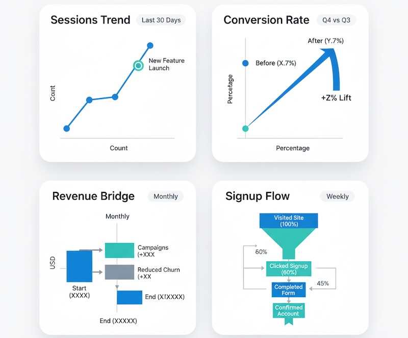
Why did this happen? Show 2–3 charts that isolate causes (mix shift, pricing, seasonality). Each visual gets a captioned takeaway: “Creative rotation reduced CPC by 22%, but CTR fell 7%.” - Implications
So what for the business? Translate metrics into dollars, risk, customer impact, or pipeline impact. Add a simple sensitivity table to show ranges. - Recommendations & asks
What should we do next? Three prioritized actions, each with predicted impact, cost, owner, and timeline.
If you must add depth, move it to the appendix. The spine stands alone.
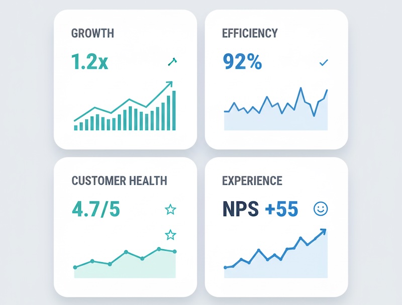
Show outcomes, not noise
Executives care about a handful of outcomes. Map your many metrics to these four:
- Growth: revenue/ARR, qualified pipeline, new customers, net adds
- Efficiency: CAC, payback, ROAS, cost per SQL
- Customer health: retention, NRR, churn drivers, LTV
- Experience: conversion rate, funnel drop-offs, Core Web Vitals, CSAT
Everything else—pageviews, impressions, bounce—belongs in drivers, not the headline.
Write like a decision memo
Use tight, business-first language:
- Lead with the answer. “Email-generated pipeline rose 14% MoM.” Not: “We analyzed multiple channels…”
- Quantify impact. Convert percentages to money or units. “+14% = +$380k in qualified pipeline.”
- State uncertainty plainly. “Estimate ±3pp due to sampling; conclusions hold across the range.” See the ASA statement on p-values for caution on overclaiming.
- Offer a trade-off. “Shift 15% spend from Display to Search; expected +$190k pipeline, −8% top-funnel reach.”
Visuals that executives actually read
Keep every chart self-explanatory without a spoken walkthrough:
- Prefer: sparklines (trend), slope charts (before/after), waterfalls (bridge to result), small multiples (channel or segment comparisons), simple funnels. Use the FT Visual Vocabulary to pick the right chart.
- Avoid: 3D, dual y-axes, rainbow palettes, dense tables.
- Always include: timeframe, segment, unit, n, baseline, annotation of any tracking change.
Caption formula: Insight, not description.
Bad: “Line chart of sessions by week.”
Good: “Organic sessions up 9% WoW after pricing page rewrite; improvement sustained three weeks.”
Rounding, denominators, and comparability
Small formatting choices change credibility:
- Round for executives: dollars to nearest thousand; rates to one decimal; avoid four-digit precision.
- Show the base: “+4.6 pp on a base of 23.1% (n=18,420).”
- Flag breaks in series: annotation when GA4 migration, pixel updates, or channel reclassification occurred.
- Normalize when needed: per 1,000 visits, per active account, per region—whatever makes comparisons fair. For practical stats refreshers, see NIST e-Handbook.
Anticipate the questions
Pre-answer the top five questions leaders ask:
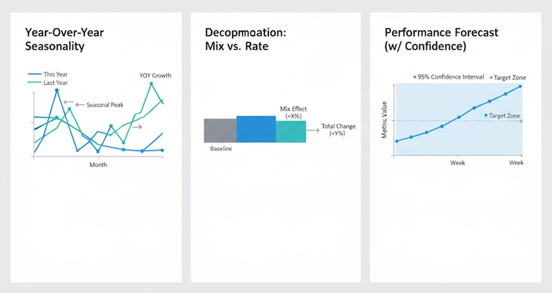
- “Is this seasonal?” Show last year’s same-period trend overlay.
- “Is it mix or performance?” Provide a decomposition: mix effect vs. rate effect.
- “Is it statistically meaningful?” Add CI bars or a single line: “95% CI excludes zero; lift likely real.”
- “What if we do nothing?” Baseline forecast with “no change” scenario. (see Forecasting principles)
- “What will you stop?” Name the trade-offs—what budget, test, or report you’ll sunset.
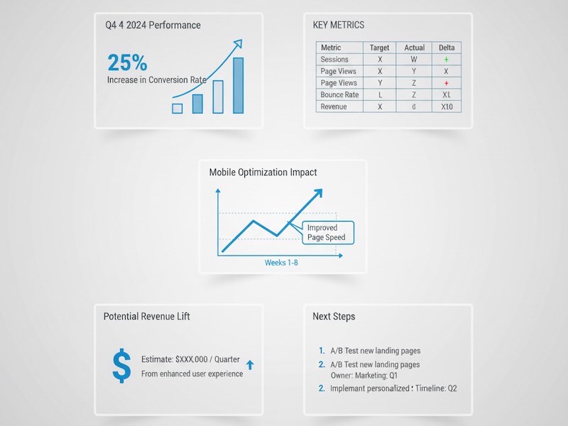
A one-page template you can reuse
Title: Outcome + time window + segment
Headline: One-sentence result and dollar impact
KPI table (4 rows): Target | Actual | Δ | Comment
Driver chart #1: What moved the needle (caption with cause)
Driver chart #2: Segment or channel breakout (caption with action)
Implications: Customer/revenue/efficiency impact in plain language
Recommendations: 3 bullets with owner, timing, projected lift, confidence
Risks & dependencies: Data quality, capacity, external factors
Appendix links: Method, full tables, QA notes
For plain-language content principles, borrow from the GDS content design guidance.
Translate analyst-speak to exec-speak
- “Sessions up 20%.” → “Top-of-funnel interest rose; no conversion lift yet—quality likely unchanged.”
- “Bounce improved 5pp.” → “Fewer visitors leave immediately; our new hero message is resonating.”
- “p=0.04.” → “We’re 95% confident the uplift is real; expected range is 2–6%.”
- “Attribution change.” → “We reclassified ‘Referral’ partner traffic to ‘Paid’; historic charts updated for apples-to-apples.”
Cadence and consistency win more than one-off brilliance
- Monthly business review: Outcomes, drivers, decisions, and progress on last month’s actions.
- Quarterly deep dive: Strategy health (LTV:CAC, payback, retention), segment performance, bets to scale or stop.
- Real-time alerts: Only when action is required (e.g., anomaly in conversion or spend runaway), with a clear playbook.
Use the same KPI layout and definitions every time. Familiarity reduces friction. Familiarity reduces friction. Public-sector practices like the US Digital Analytics Program illustrate lightweight, consistent reporting.
Make your recommendations budget-ready
For each ask (spend, headcount, tooling), include:
- Projected impact: range, not a point estimate.
- Time to value: how soon results show.
- Proof: pilot results, benchmark, or sensitivity.
- Opportunity cost: what you won’t do if this is approved.
Executives approve clarity and confidence, not spreadsheets.
Common reporting mistakes (and quick fixes)
- Too many metrics upfront → Lead with 1–3 outcomes; park the rest in drivers.
- Percentages without scale → Add counts or dollars.
- Mixing timeframes → Align windows (e.g., all 28-day).
- Pretty visuals, vague takeaways → Write the learning as a caption.
- No action → Every report ends with decisions, owners, and dates.
Quality and governance: your quiet superpower
- Data dictionary & versioning: Stable definitions; changelog for metric adjustments.
- QA checklist: Source parity, outlier scan, attribution rules applied, sampling noted.
- Accessibility: Color-blind-safe palettes, alt text in docs, large labels.
- Distribution: Send the one-pager before the meeting; start the live session at slide 1 (the answer).
The payoff
Boss-friendly reports aren’t “dumbing down” analytics—they’re elevating it. When leaders instantly grasp what changed, why it matters, and what to do, analytics moves from reporting the past to steering the business. That’s how your work earns a seat at the strategy table.