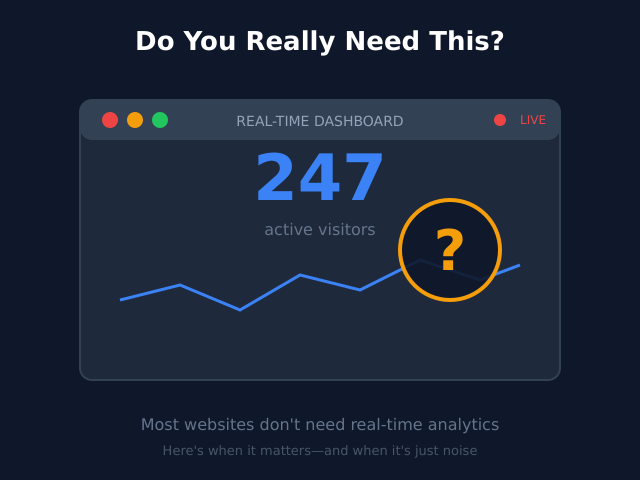
Agencies live and die by two things: results and reputation. Internally, that translates to how effectively teams deliver work—and how respectfully leaders treat the people doing it. Team analytics can sharpen decisions on staffing, pricing, and delivery quality, but careless data use can erode trust, trigger burnout, and expose the business to risk. This article outlines a pragmatic, non-intrusive approach to measuring team performance while honoring employee privacy.
Why balance matters (commercially and ethically)
- Revenue & margins: Without visibility into capacity, rework, and cycle times, scoping drifts and margin evaporates.
- Talent retention: Over-surveillance drives attrition. Trusted teams ship better work and stay longer.
- Brand risk: Misusing employee data can create legal exposure and damage your employer brand.
- Quality: Clear, fair metrics help teams focus on what actually improves client outcomes—not vanity activity.
The principle: Measure the system, not the person. Use analytics to illuminate patterns and remove friction, not to micromanage.
The right level of measurement: team first, role second, individual last
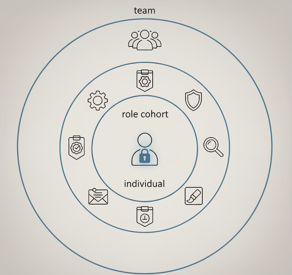
Think in three concentric circles:
- Team-level metrics (default): What clients buy is team output. Aggregate here by default.
- Role cohort metrics (guardrails): Designers, developers, strategists—compare patterns to spot systemic issues (e.g., overloaded roles).
- Individual metrics (opt-in, purpose-limited): Use sparingly for coaching, never for public dashboards or punitive ranking.
This hierarchy preserves privacy and pushes managers to fix process before pointing to people.
A practical, privacy-respectful scorecard
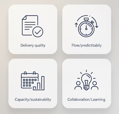
Keep the scorecard compact and explain why each metric exists. Example monthly set:
1) Delivery & quality
- On-time delivery rate (team) – share of milestones met against committed dates.
- First-time acceptance rate – % of deliverables approved by clients without rework.
- Defect/revision density – revisions per deliverable type (e.g., per wireframe). Track trends, not names.
- Client satisfaction (post-milestone pulse) – a 1-5 rating plus “one thing to improve.”
Why it’s ethical: Focuses on outcomes clients feel, not keystrokes or screen time.
2) Throughput & predictability
- Cycle time (request → done) – median and p90 by work type.
- WIP (work in progress) limits adherence – % of time the team stayed within agreed WIP.
- Flow efficiency – active time vs. waiting time; shows process bottlenecks without singling out individuals.
Why it’s ethical: Highlights systemic friction (handoffs, approvals) rather than “who is slow.”
3) Capacity & sustainability
- Planned vs. actual utilization (team) – capacity forecast vs. actual billable allocation.
- Over-capacity exposure – % of weeks > 90% allocation sustained.
- Time-off coverage sufficiency – planned coverage vs. gaps.
Why it’s ethical: Prevents chronic overuse; protects well-being.
4) Collaboration & learning
- Cross-functional pairing rate – portion of work involving 2+ disciplines.
- Knowledge share cadence – lightweight lunch-and-learns, postmortems held vs. planned.
Why it’s ethical: Values shared learning, not just output volume.
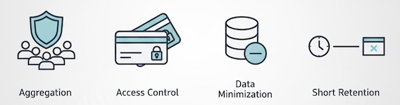
Guardrails that protect employee privacy
- Aggregation by default: Report at team or project level; suppress slices below a minimum group size (e.g., <7 people).
- Purpose limitation: Tie each metric to a specific management decision (staffing, scoping, pricing). If a metric lacks purpose, drop it.
- Minimal data principle: Avoid raw logs or invasive telemetry; store counts, medians, and trends.
- Short retention for granular data: Keep only what you need for trend analysis; archive aggregates.
- Access control & context: Managers see operational aggregates; executives see trend rollups; individuals see their own data privately.
- Plain-language transparency: Publish a brief “How we measure work” note that states what’s tracked and what’s never tracked (e.g., keystrokes, screenshots).
Incentives: design for outcomes, not gaming
Misaligned incentives create metric theater. Set goals that:
- Reward system improvements: Faster cycle time via fewer handoffs, clearer briefs, and realistic WIP—not longer hours.
- Include quality checks: Pair efficiency targets with first-time acceptance or CSAT so speed doesn’t degrade output.
- Value sustainability: Celebrate reductions in over-capacity exposure and improved predictability.
- Maintain fairness: Compare like with like—work types, complexity, and client profiles differ.
Avoid leaderboards and public individual comparisons; they distort behavior and harm trust.
Bias and fairness: keep the lens clean
Analytics can amplify bias if left unchecked. Build fairness into interpretation:
- Context before conclusion: A spike in cycle time may reflect scope creep or client response lag, not team performance.
- Rotation of complex work: Track distribution of “hard” tickets; don’t punish teams that take on more complexity.
- Role-aware benchmarks: Designers and engineers have different cadences; don’t force one yardstick on all.
- Check for disparate impact: Review whether any segment (location, schedule, tenure) is consistently penalized by a metric and investigate structural causes.
Dashboards that people actually use
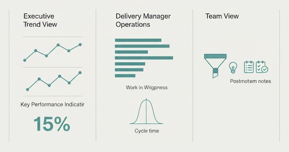
For executives (monthly/quarterly):
- Margin health by portfolio, on-time rate, first-time acceptance, capacity risk, client satisfaction trend.
- One slide: risks, decisions needed, experiments running.
For delivery managers (weekly/monthly):
- WIP, cycle time (median/p90), rework trend by deliverable type, planned vs. actual utilization, upcoming constraint forecast.
- One line per metric: “So what / Now what.”
For teams (bi-weekly):
- Process metrics they can influence: handoff delays, ambiguous briefs, blockages.
- Postmortem insights and learning wins—no name-and-shame.
The rule: dashboards should change behavior within the team’s control.
Red flags to avoid
- Surveillance-style data (keylogging, screenshots): Breaches trust, adds noise, offers little causal insight.
- Public individual rankings: Encourage sandbagging and risk-averse behavior.
- Single-metric management: Optimizing for utilization alone burns people and hurts quality.
- Opaque models: If people can’t understand how a score is calculated, don’t use it to make decisions.
- Infinite retention: If you wouldn’t justify keeping a dataset to the team, delete or aggregate it.
Case vignette (composite)
A 45-person creative/tech agency saw slipping margins and late deliverables. Leadership resisted surveillance and chose a team-first scorecard. Within two quarters:
- Cycle time (p90) dropped 24% after enforcing WIP limits and introducing clearer intake (no personal monitoring involved).
- First-time acceptance rose from 62% to 76% by standardizing briefs and adding internal reviews.
- Over-capacity weeks fell by half after capacity forecasts were used to shift deadlines earlier—burnout metrics improved.
- Client satisfaction climbed 0.4 points on a 5-point scale; upsell close rates improved because delivery felt predictably good.
All reporting stayed at team/cohort level; individuals accessed only their personal views for self-reflection.
Handling tough questions from staff
- “Will this be used to rank us?”
No. Metrics guide process decisions and resource planning. Individual data is private and used for coaching by consent. - “What exactly is being tracked?”
Work artifacts and outcomes (e.g., cycle time, revisions), not screens, keystrokes, or messages. Aggregated by default. - “Can we challenge a metric?”
Yes. Every metric has an owner and review cadence. If a number doesn’t reflect reality, we examine assumptions and adjust.
Leadership behaviors that make the numbers meaningful
- Model transparency: Share the scorecard and its purposes; repeat the privacy boundaries.
- Ask system questions first: “What in our intake, staffing, or client comms made this late?”
- Reward improvement experiments: Time-box changes, review results, and scale what works.
- Protect recovery time: Treat sustained >90% allocation as a risk to be managed, not a badge of honor.
Bottom line
High-performing agencies measure flow, quality, and sustainability—and they do it in ways that respect people. Keep analytics team-first, purpose-bound, and transparent. You’ll get the operational clarity you need to price accurately, deliver reliably, and grow profitably—without compromising employee privacy or culture.