Redesigns are expensive—and risky. Before you change layouts, colors, or IA, ask a simpler question: Is our current design helping users do what they came to do? The cleanest way to answer is with data, not taste. Below is a practical framework to analyse website design using behavioral signals you already collect, so you can defend design decisions with evidence.
First, what are website traffic analytics telling you about design?
At a basic level, traffic data shows how people arrive, who they are, and where they go next. But for design evaluation, focus less on vanity counts and more on behavior per template (home, landing, product, article, pricing, checkout). In other words, treat analytics for UX questions, not just channel performance. This is user experience analytics—connecting layout and content choices to user outcomes.
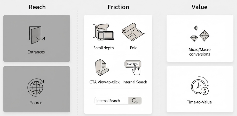
The three-lens framework: Reach, Friction, Value
Use this simple model to turn raw numbers into design judgments.
1) Reach (Are the right people seeing the right pages?)
- Landing page mix (top entrances): Are people entering where the design has a clear primary action?
- Device and viewport split: Small screens demand ruthless prioritization.
- Source alignment: Paid social visitors skim; organic visitors often research. Your layout should reflect that.
2) Friction (Where does the experience stall?)
- Scroll depth & fold rate: Do users reach critical content (pricing table, feature grid) without excessive scrolling?
- Primary CTA view-to-click rate: Of all sessions that saw the CTA, what percent clicked?
- Navigation loops: Repeated toggling between nav and the same 2–3 pages suggests labeling or IA issues.
- Internal search spikes: Users “searching for what the layout should surface” is a red flag.
3) Value (Do design choices move business metrics?)
- Micro-conversions: Email signups, add-to-cart, trial starts, “request demo,” downloads.
- Assisted conversions: Pages that rarely convert directly but occur in successful paths.
- Time-to-value: How quickly do users reach the first meaningful interaction?
This is analytics for UX, not a channel report. The point is to link design patterns to observable behavior.
Page-by-page signals that reveal design strength
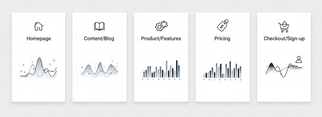
Homepage
- Healthy: Clear primary path; high hero CTA view rate; concise nav interactions; quick clicks to top tasks.
- Warning: Carousel blindness (low interaction with slides beyond #1); high internal search for basics (“pricing,” “contact”).
- Decision use: If the hero view-to-click rate is strong but downstream pages underperform, your problem likely isn’t the homepage.
Content & blog
- Healthy: Steady scroll to related content, meaningful clicks on in-line CTAs, strong “next step” CTR (e.g., case study -> demo).
- Warning: High exits after long reads (no handoff), or high bounce on short reads (intro doesn’t match headline intent).
- Decision use: Editorial design should prioritize next-step modules over generic “recent posts.”
Product / features
- Healthy: Users reach comparison tables, pricing previews, or “how it works” blocks; tabs accordions actually get opened.
- Warning: Heavy tabbing with low dwell (information hidden behind controls nobody reads).
- Decision use: Flatten key information and reduce interactive complexity if controls are under-used.
Pricing
- Healthy: High rate of plan card visibility and clicks; engagement with FAQ or “what’s included.”
- Warning: Excess toggling between monthly/annual with no selection; spikes in internal search for “discount” or “hidden fees.”
- Decision use: If pricing layout triggers hesitation, test clarity improvements before rethinking price itself.
Checkout / sign-up
- Healthy: Short time-to-first-field; minimal step re-visits; low error messages per session.
- Warning: Back-and-forth between shipping/payment, or abandonment after promo code field exposure.
- Decision use: UI pacing and form chunking likely matter more than additional trust badges.
Segment comparisons to pressure-test design
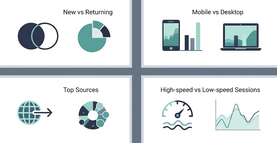
- New vs. returning: If only returning users succeed, the design assumes prior knowledge.
- Mobile vs. desktop: A beautiful desktop grid can be a mobile maze. Compare CTA view-to-click deltas.
- Top sources: Align page intent to source intent. Paid social needs skimmable proof; organic needs depth and internal links.
- High-speed vs. low-speed sessions: Slower experiences amplify design shortcomings (complexity, long hero videos).
Metrics that turn debate into action
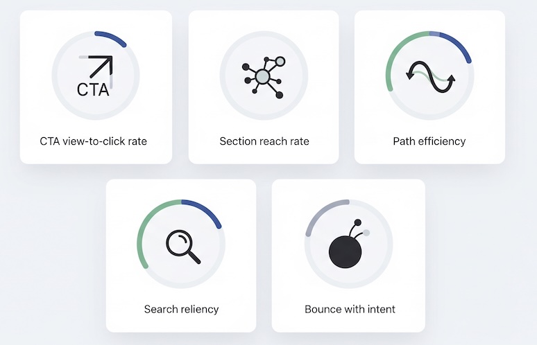
To keep discussion objective and implementation-free, define a short scorecard:
- CTA view-to-click rate (per template): Measures clarity, not just traffic.
- Section reach rate: % of sessions that reach your key module (e.g., pricing table). Low reach = layout or fold issue.
- Path efficiency: Median number of steps from entry to micro-conversion on successful journeys.
- Search reliance: % of sessions using internal search to find basics that the layout should expose.
- Bounce with intent: Bounces where users saw a primary element but didn’t act—signals message/design mismatch.
These help answer the board’s inevitable question: Does our design work, or are we simply buying more traffic?
Interpreting common patterns
- High traffic, low CTA exposure: Hero is too tall, imagery heavy, or above-the-fold content lacks orientation.
- Good exposure, poor clicks: The value proposition isn’t legible or the CTA label is ambiguous for that context.
- Strong clicks, weak completion: Downstream page design creates friction (confusing forms, option overload, hidden fees).
- Deep scroll, shallow action: Content blocks educate but don’t guide—no visual handoff to the next step.
- High tab/accordion usage with quick back-outs: Users are digging because the primary narrative isn’t clear.
When to iterate vs. when to redesign
Iterate when the pain is localized and measurable:
- One or two templates underperform (e.g., pricing and features).
- Metrics point to specific layout issues (low section reach, unclear CTA labels).
- Mobile-only issues with otherwise solid desktop performance.
Consider a broader redesign when the signals are systemic:
- Cross-template symptoms (navigation loops, heavy reliance on search, inconsistent visual hierarchy).
- Device-level breakdowns (mobile conversion <50% of desktop without justification).
- Brand and content architecture no longer match product complexity or portfolio.
Executive-friendly artifacts that speed decisions
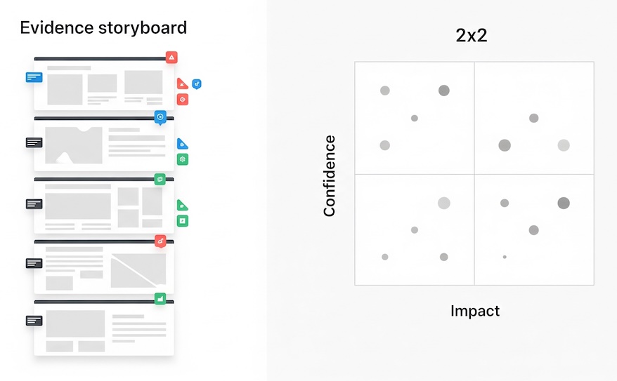
- Evidence storyboard: Screenshots of key sections annotated with the metric next to each element (e.g., “Hero CTA: 2.1% view-to-click”).
- Opportunity map: A simple 2×2 of impact vs. confidence, populated by metric-backed ideas (e.g., “Flatten pricing FAQs; 42% never reach them”).
- Before/after narrative (projected): “If we raise pricing table reach from 58% to 75%, and maintain current click rate, we add X trials/week.”
These artifacts answer “why now?” without diving into tooling or technical setups.
FAQ your stakeholders will ask
Is bounce rate proof of bad design?
Not by itself. Pair bounce with intent exposure—if users saw your main element and still left, the message/layout likely missed.
How much time on page is ‘good’?
Time without progress isn’t value. Prioritize time-to-first-meaningful-action and section reach.
Can we compare ourselves to benchmarks?
Lightly. Template-level comparisons (e.g., pricing page CTA view rates) are more informative than sitewide averages.
Bottom line: Stop arguing preference. Start by asking, “Given our goals, what behaviors should this page create?” Then check the data against that expectation. If you’ve wondered what are website traffic analytics good for beyond channel reports, here’s the answer: they let you evaluate whether your design enables user progress. That’s the essence of user experience analytics—practical, decision-ready, and defensible.